Akira Isogawa X
Ashe
Collaboration
Designer
The Akira Isogawa X Ashe occured in 2015/2016 between the Akira Studio in Sydney and the Ashe studio in Fremantle, WA and was supported by the Department of Culture and the Arts.
"I've long been an admirer of the work of Akira Isogawa, due to the artisan approach to textile. I fulfilled an ambition to work with Akira after receiving a Department of Culture and the Arts Grant to travel to Sydney and work with Akira on an exclusive textile design.
The first design meeting with Akira was important as I was allowed the privilege of looking through his archive of previous and current collections. He carefully guided me through the garments, explaining different prints (of which many he had designed himself) and their significance.
On close inspection, a print which appeared like a densely arranged traditional Japanese floral of chrysanthemums, cherry blossoms and irises had Persian-style arabesque motifs. He described it as ‘very Australian. Multi-cultural’ (Isogawa, personal communication, 2015), which was significant as it indicated his view of cloth as a place where cultural ideas and symbols can merge and that his understanding of
Australian culture was inherently multicultural.
We discussed the problem I had encountered myself that although the medium of screen print allowed a
hand-made quality much favoured to the flatness of digital printing, the cost and environmental hazard
were not conducive to reproduction even for limited edition runs of garments.
Through a process of discussion via email and our initial meeting, I translated a series of images and colour palettes that Akira provided, with his encouragement to experiment with the scale of textile motif on the body and layout.
To circumvent the drawback of using digital prints, I experimented with adding texture to the designs digitally using Photoshop software. Akira responded most favourably to designs which were unfinished and slightly messy, retaining evidence of pencil lines or layered textures which he described as ‘having character’ (Isogawa, personal communication, 2016) but could also be described as possessing a beauty of things imperfect, namely, wabi-sabi.
Wabi-sabi, in its purest, most idealised form, is precisely about these delicate traces, this faint
evidence, at the borders of nothingness. Wabi-sabi accommodates to degradation and attrition, corrosion and contamination make it richer, solicits the expansion of sensory information [and] is
comfortable with ambiguity and contradiction. (Koren 1994, 26-27)
The process of working with Akira was very experimental. Although he initially encouraged me to
create cleanly delineated designs with intense bold colour, he later suggested that I ‘rough them up’ and
lighten the colourways (Isogawa, personal communication, 2016).
I developed two ‘multicultural’
Japanese all-over patterns, 'Multi' and 'High Summer' , which had the overall appearance of Japanese prints, but also included injections of motifs from other cultures. Individual motifs from these designs such as the chrysanthemum and peony flower motif were isolated and arranged into different fukinsei (asymmetrical) layouts.
I was asked to experiment with overlays of a decorative but disruptive graffiti element which introduced datsuzoku, a rebellious type of freedom in design that is unbound by convention and a theme in Japanese aesthetics.
Over a period of four months, over 50 designs were created which I overlayed into a modern ukiyo-e style cropped fashion illustration so that scale on the body could be
discerned. This intense phase of design, discussion, reflection and review elucidated the way in which
Akira navigates through the design process.
The final designs that were chosen for production for his
Autumn/Winter 2017 and Spring/Summer 16/17 collections, Trellis and Trellis Chyrsanthemum were arrived at after much experimentation and attention to detail.
The design layout needed to operate in a specific scale to proportions of the body that were pleasingly in balance and therefore shizen (without pretense, natural, nonchalant), with elements of kanso (simplicity) and seijaku
(tranquillity) which were created by the understated colour palette.
In 2018, the design was also used on a collaboration between Akira and Blunt Umbrella's for an Umbrella surface design.
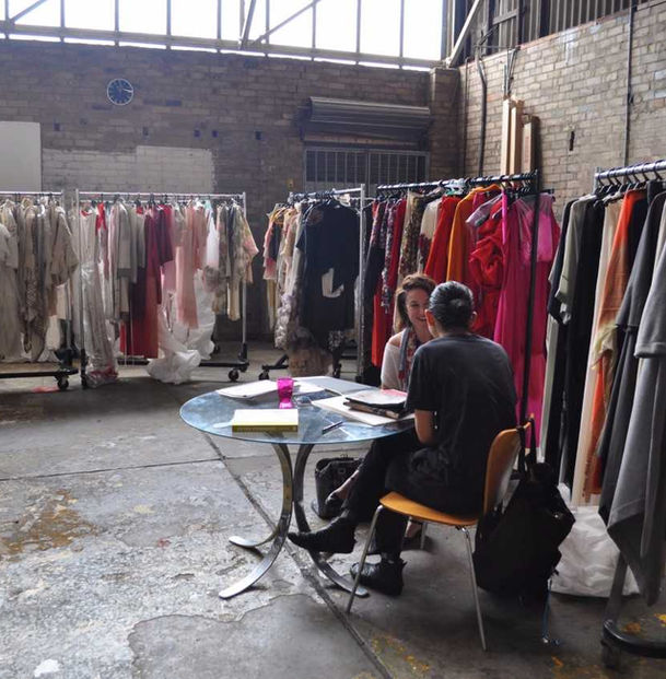
In the Akira Studio, Sydney, NSW.

Various Iterations and versions of the final 'Chyrsanthemum ' Design.

Design Development, Kelsey Ashe.


